From my “I can’t believe it’s not broader” file, I would like to introduce you to the…
Faber-Castell Basic Fountain Pen
Price: $45.00 (+ $5 for the converter)
Nib: Extra Fine
Filling System: Converter & Standard International Cartridges
About the Pen:
Founded in 1761, Faber-Castell is one of the oldest and most well known manufacturers of writing instruments and art supplies. 1761. That’s over 250 years. Two and a half centuries. We’re talking a quarter of a millennium, people. They’ve been around a while. They’ve had lots of time to perfect their products. And it shows.
I bought this pen a long time ago, and never got around to inking it up. I figured that because it’s a European pen, the nib would probably be broader than I’d prefer. When I finally tried the pen, I entered a fit of jubilation and regret: Jubilation over how fine a line it actually puts down, and regret over having let it sit in a drawer for so long.

Appearance:
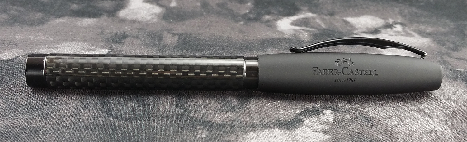
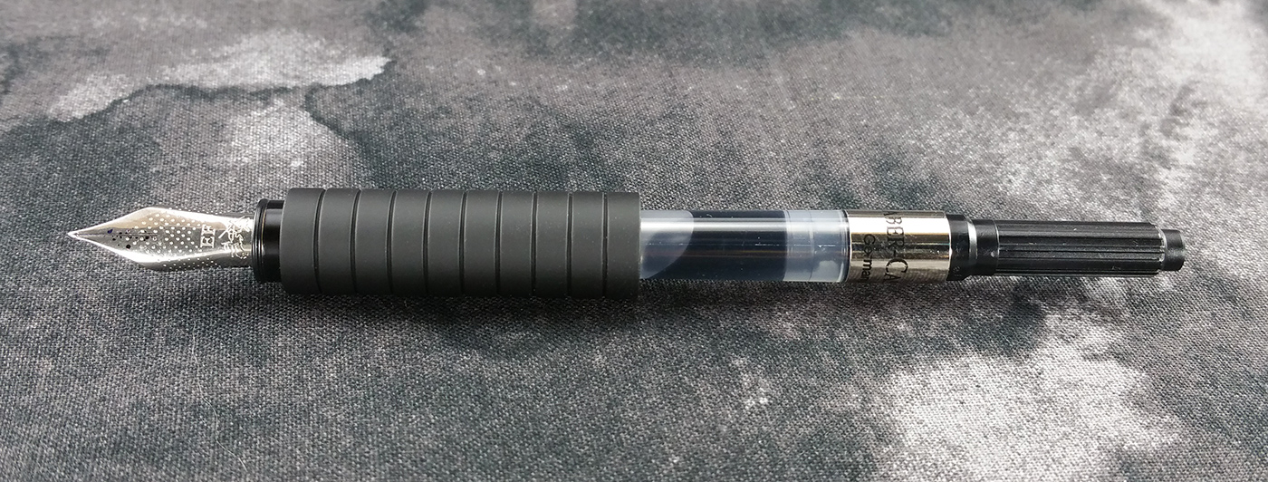
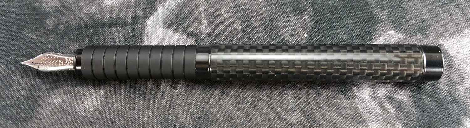
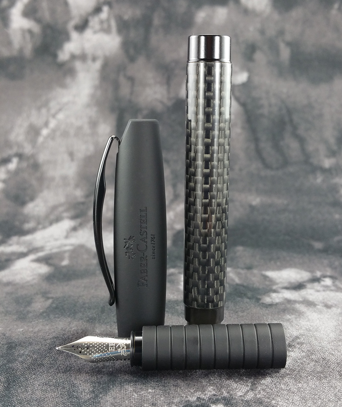
Stately. Refined. Stealthy. The Faber-Castell Basic has quite an interesting design. The pen’s body is a straight-lined cylinder. Although the diameter is not uniform from the end cap to the section, there’s a noticeable lack of tapering anywhere. The cap, however, is an exercise in tapers and swoops. From the pronounced arc of the clip to the concave end, just about every surface of the cap has some sort of contour to it.
This is probably going to be one of my longest pen descriptions yet, so I apologize in advance for its length. It’s worth it, though, so don’t skip ahead.
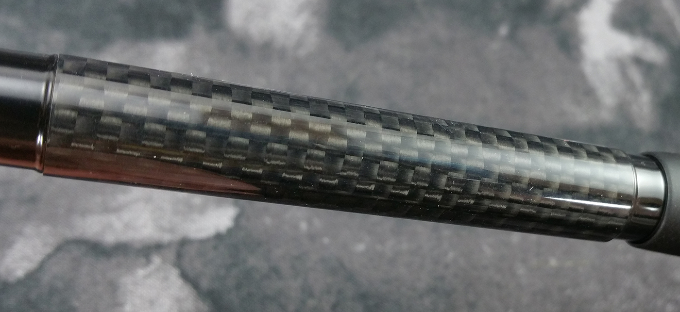
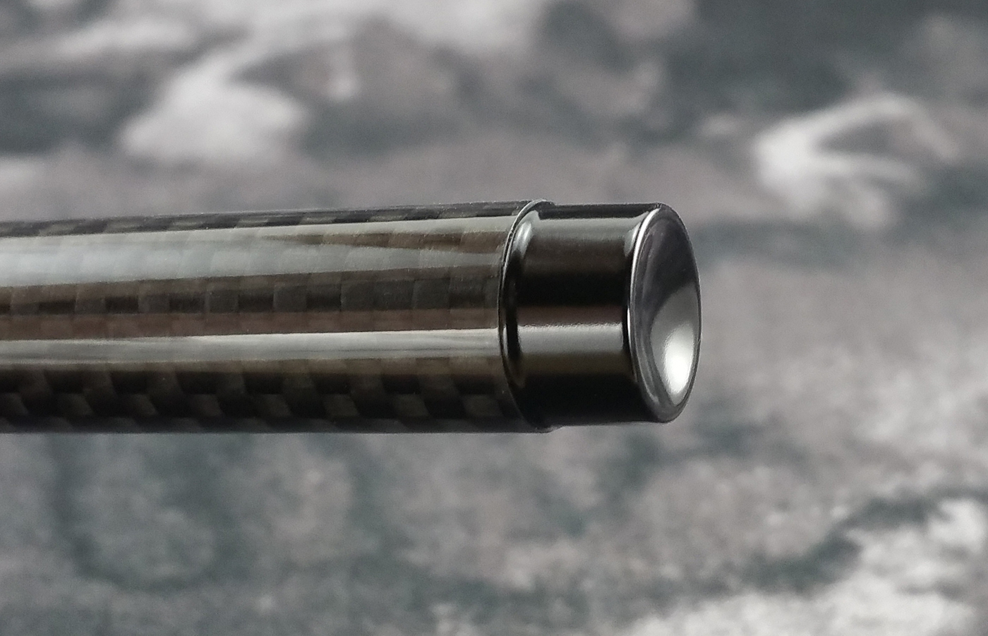
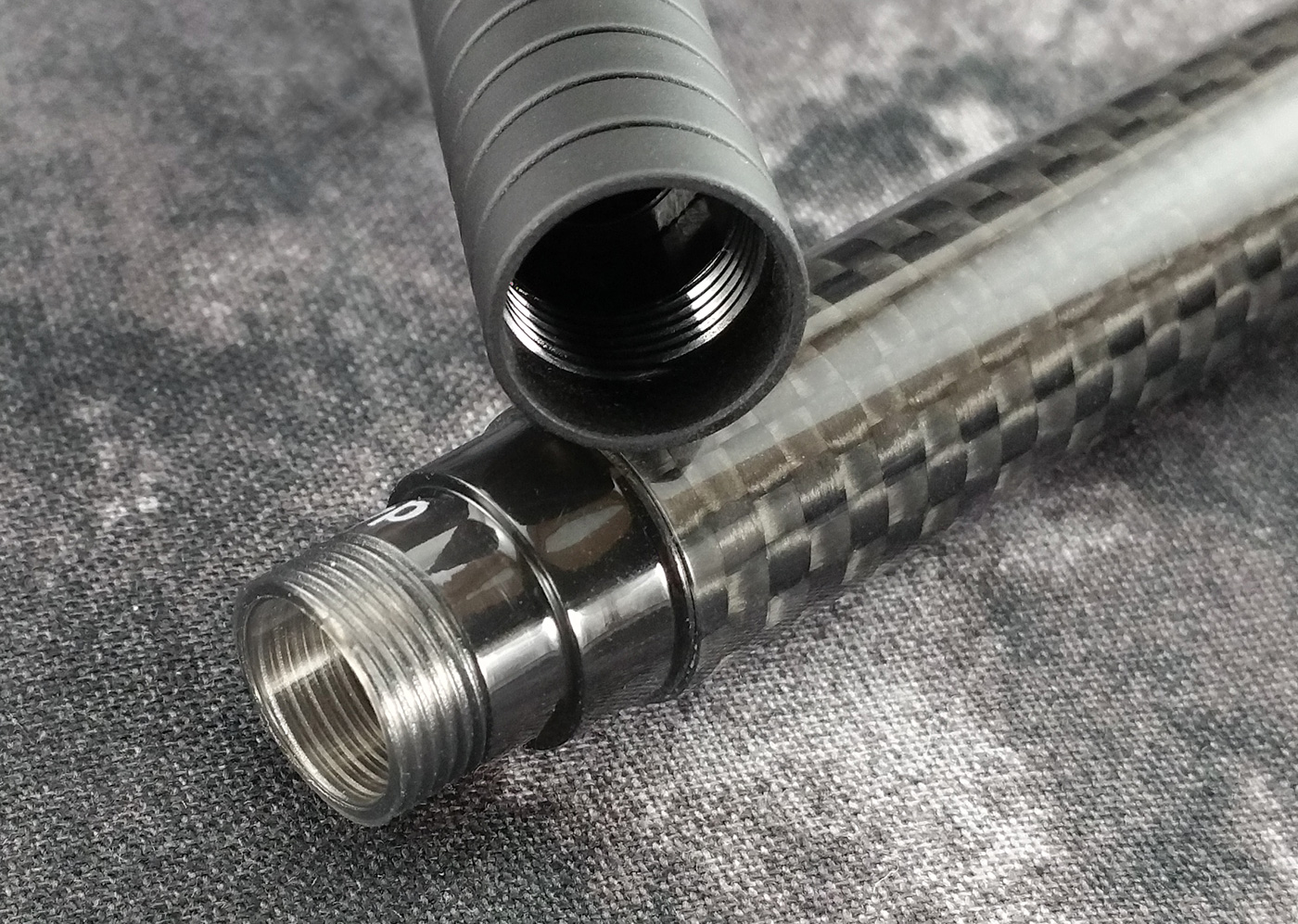
There are a few different body materials available on the Basic. Being easily seduced by stealth pens, I got the carbon fiber model, which I believe is the lightest version at 27 grams. I’ve heard a number of people complain about the metal-body versions being too heavy, but I find the carbon fiber version to be a very pleasant weight. And the carbon fiber’s weave is absolutely flawless.
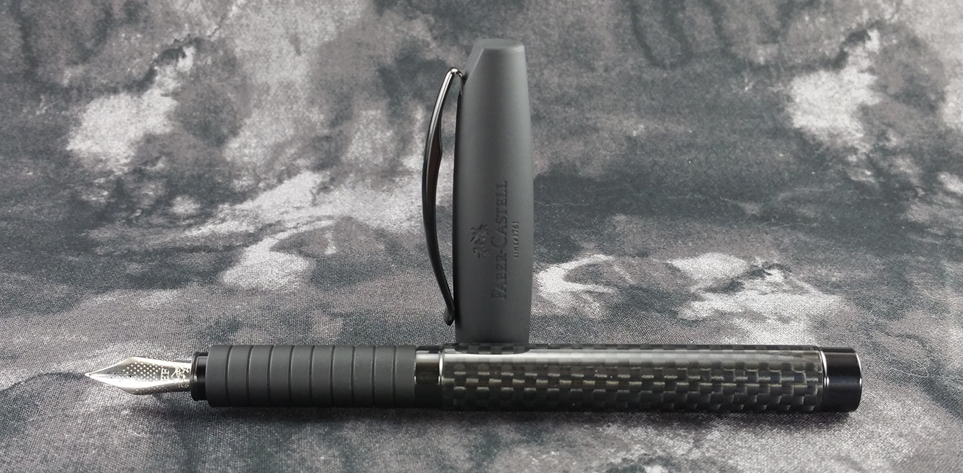
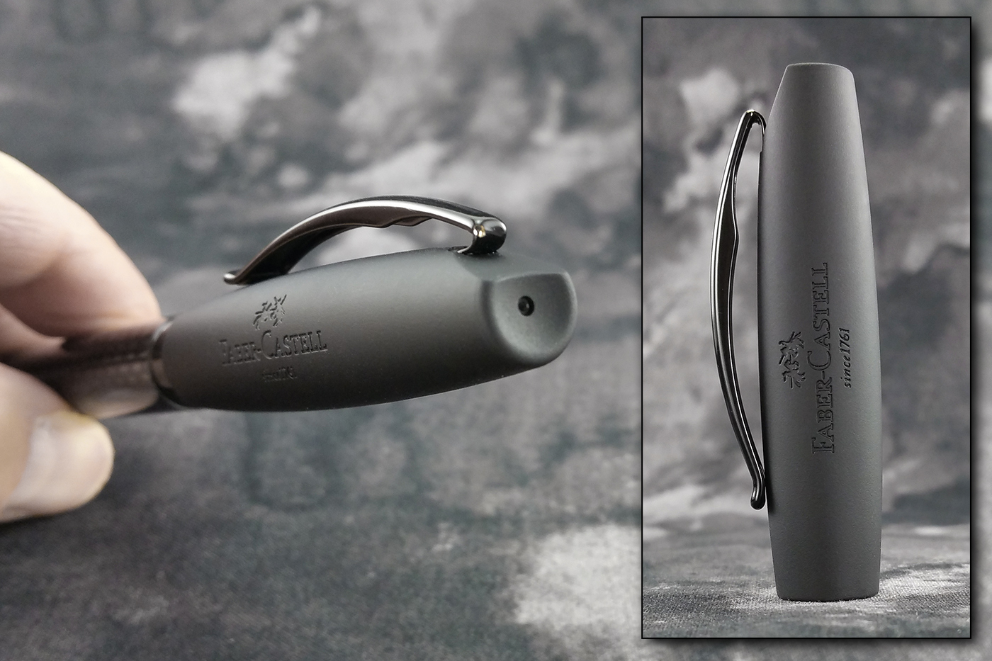
The end cap is a simple, black, button-shaped piece with a concave end. It’s simple, elegant, and attractive.
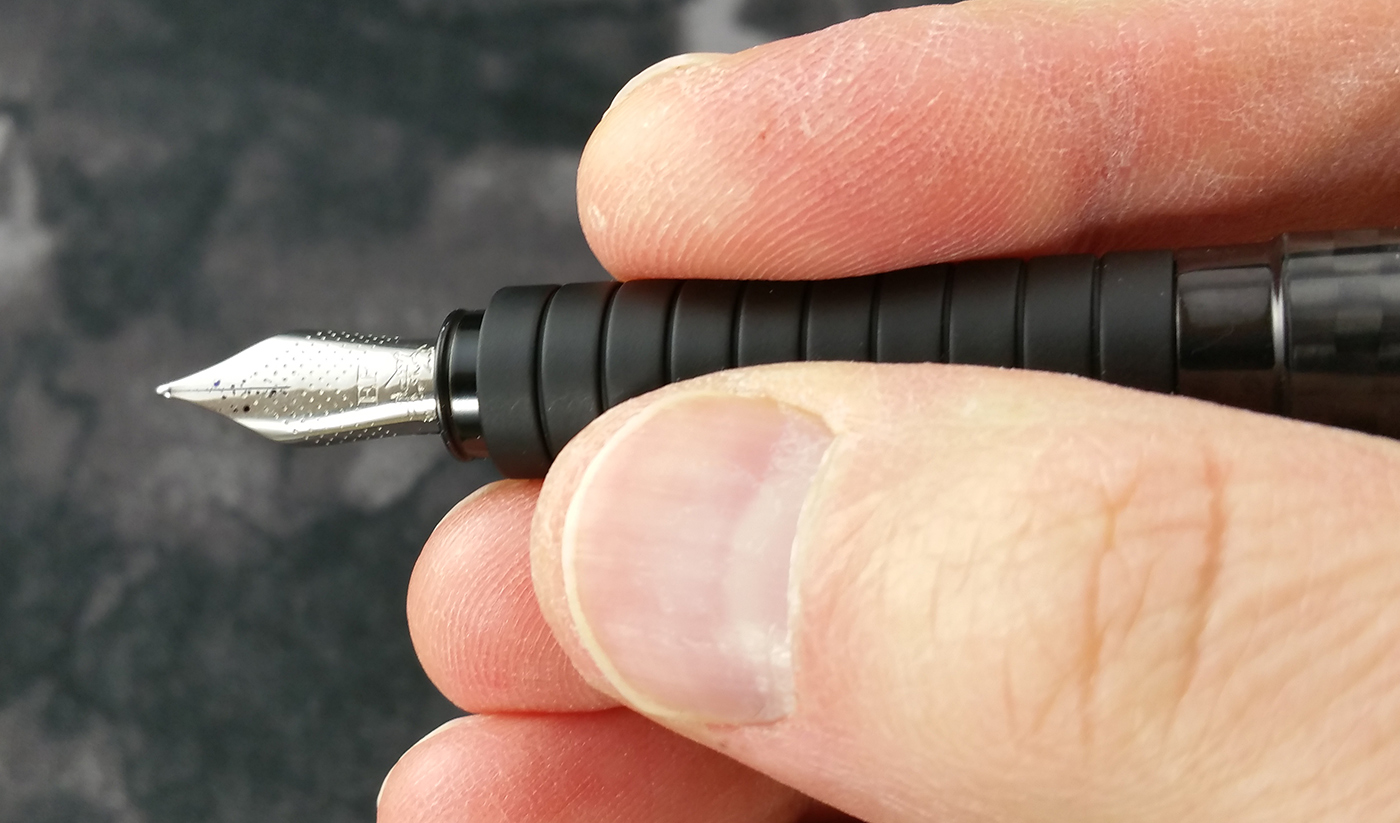
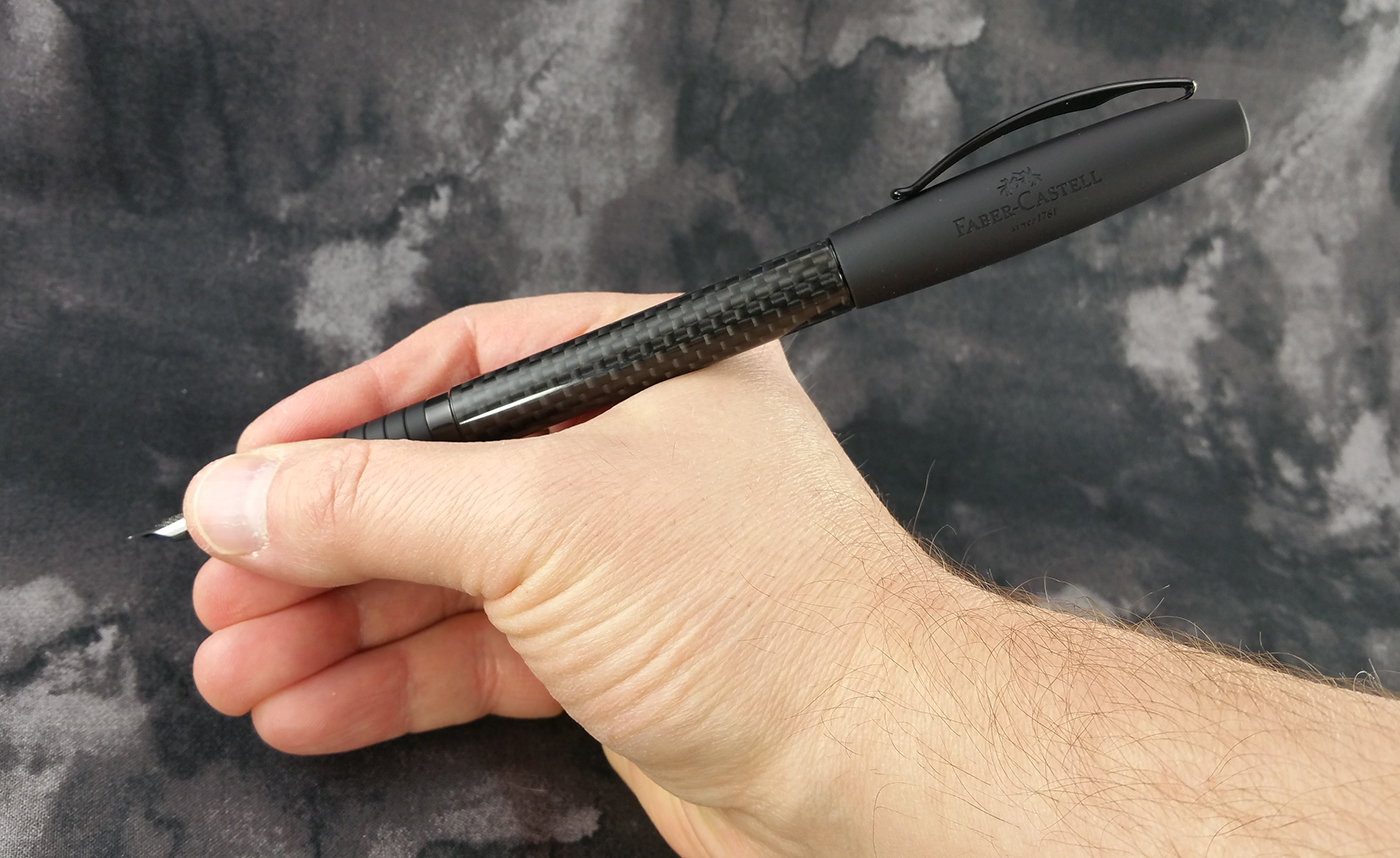
Both the cap and the grip are made of a nice, soft-touch material that feels silky and luxurious. The surface of the grip has a series of grooves in it for extra grippability (Yes, it’s a word. No, don’t bother looking it up. Really. Just trust me on this. Close that damn dictionary and keep reading!). I’m not crazy about the way the section looks, but it’s really comfortable to hold.
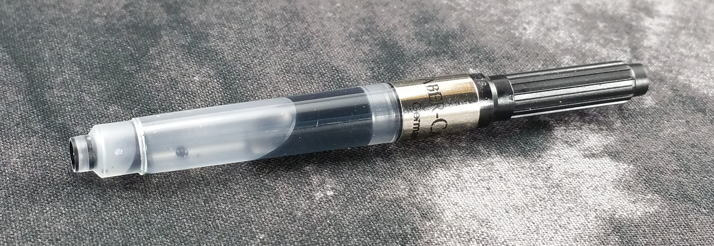
Something that’s hard to tell from these photos is that there is an ink window built into the open end of the barrel. It’s a dark and smoky, partially translucent plastic window. You can’t really see through it, though, unless you hole the pen up to a bright light.

In stark contrast to the pen’s body, the cap is all kinds of curvy. It’s widest in the middle and tapers down to both ends. The cap has no finial. Instead, it ends in a simple concave surface that matches the end cap. Embossed into the cap’s soft-touch surface appears the jousting knight logo, FABER-CASTELL, and since 1761.
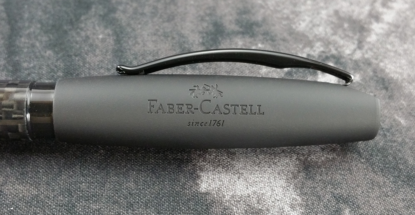
And the clip is a very sturdy, arch-shaped strip of metal that turns upward at the end ever-so-slightly, presumably for easier pocket insertion…but I find that this little flare isn’t long enough and doesn’t help in slipping into a pocket. It really should be a millimeter or two longer to be effective. As far as function, though, the clip is fantastic. It’s soft enough to open easily, but holds pretty tightly. I’d be comfortable clipping this pen into my shirt pocket and running an obstacle course…because…I couldn’t imagine trying to run an obstacle course without a fountain pen.
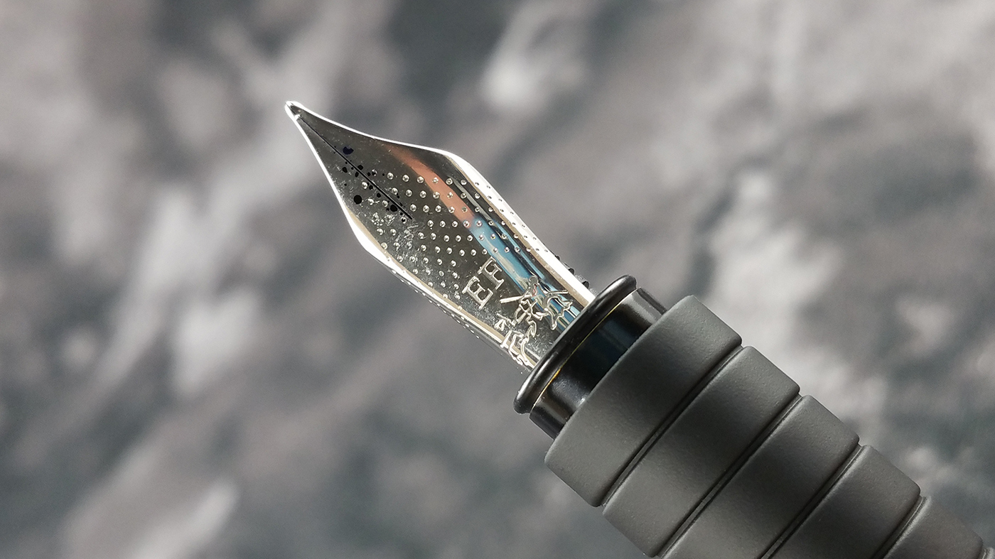
The simple, stainless steel nib is very close to a standard #5 in size. There’s no breather hole, but that doesn’t seem to affect ink flow at all. In fact, this pen has yet to fail to write or give me a hard start, so whatever they did to compensate for the lack of a breather hole clearly worked.
The surface of the nib has a nice dot pattern stamped into it, along with the nib grade (EF in my case) and the Faber-Castell logo, which is practically impossible to tell what’s depicted. For the life of me, I couldn’t figure out what the logo is supposed to represent until I went to their site and looked it up. It’s an image of two knights on horseback, jousting with pencils. It’s kind of a busy logo for a nib, but whatever…it’s fun and it works. If you’re interested in the story behind the logo, Faber-Castell has a nice write-up on its history. Check it out!
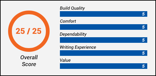
Build Quality (5/5):
Of all the pens I’ve used, I have to say I think the build quality of the Basic exceeds all others, with the possible exception of the Pilot VP and the Lamy 2000. I’d say these three pens are equally well designed, built, and assembled. They’re like pieces of art.
I have yet to find any serious flaws in this pen. The soft-touch surfaces of the cap and section are perfect, the machining of all threads is perfect, the fit and finish of all the parts are perfect. Anywhere two pieces of different diameters are assembled, they made sure the step from one piece to another is bevelled, eliminating any possibility of sharp edges anywhere you might hold the pen.
Nothing rattles, shakes, moves, shifts, or jumps when using or holding the pen. The cap snaps on securely, and if I had any complaint at all, it would be how much force it takes to remove the cap. It’s not unreasonable or difficult, but it does take a slight bit of force to separate from the barrel. I think with most pens, this wouldn’t be an issue, but the section on the Basic is really long. So if you’re not pulling the cap off perfectly straight, it’s really easy to scrub the nib against the inside of the cap. This gets ink on the inside of the cap, which then transfers the ink to the section when you cap it. Then you start getting ink on your fingers, which isn’t so great if you’re at work. I typically just use my thumb to dislodge the cap, then slide it off gently. This seems to work fine.
I would have no fear of using this pen as an every-day writer. I think it could provide years of steady use without falling apart.
As you can see from my pictures, my Basic is equipped with the Faber-Castell Design converter. I keep seeing all over the place that this converter won’t work with the Basic. For example, The Goulet Pen Company specifically states on the product page that this converter won’t work, and that if you buy a Basic, you should get a Monteverde converter instead.
I’m using the Faber-Castell converter with no problem. Apparently, some people have had issues where the barrel cavity is too tight and when you separate the barrel from the section, that the barrel pulls the converter out of the section and spills ink. I’m not sure if there was a change in the barrel design or if I’m just lucky, but with my pen, the converter slides in and out of the barrel just fine. If you purchase this pen, keep in mind that you might need a different converter.
Dependability (5/5):
So if you’re at all familiar with my other reviews, you know how I feel about fountain pens. I don’t consider them showpieces, I consider them writing instruments. I put ink in them and I write with them. For me, a fountain pen has but one job: to write. Any pen that doesn’t write all the time isn’t doing its job.
Every time, all the time: that’s my motto.

The Faber-Castell Basic writes every time, all the time. Without fail. If I leave it sit for a week, when I pick it up, it writes immediately. If I leave it uncapped for five minutes to take some pictures, when I come back to it, it writes immediately. I have not had a single hard start, skip, hiccup, pause, break, nap, or argument. It just writes. And I love it for that.
Comfort (5/5):
I don’t have a single complaint when it comes to comfort. I haven’t experienced any discomfort at all: No cramps, no fatigue, no pain. I think the weight, balance, and size of the pen are perfect for the way I write. And I just love the soft-touch grip. It makes me want to hold the pen and put the nib to paper.
It’s joyous!
The section is very long, so regardless if you hold the pen close to the nib or farther back on the body, there’s plenty of grip area to hold onto so you don’t have to hold the barrel. And even if you do hold it way far back on the barrel, the ink window is flush with the grip, and the step from the ink window to the barrel is beveled, so there are no sharp edges to dig into your fingers.
Writing Experience (5/5):
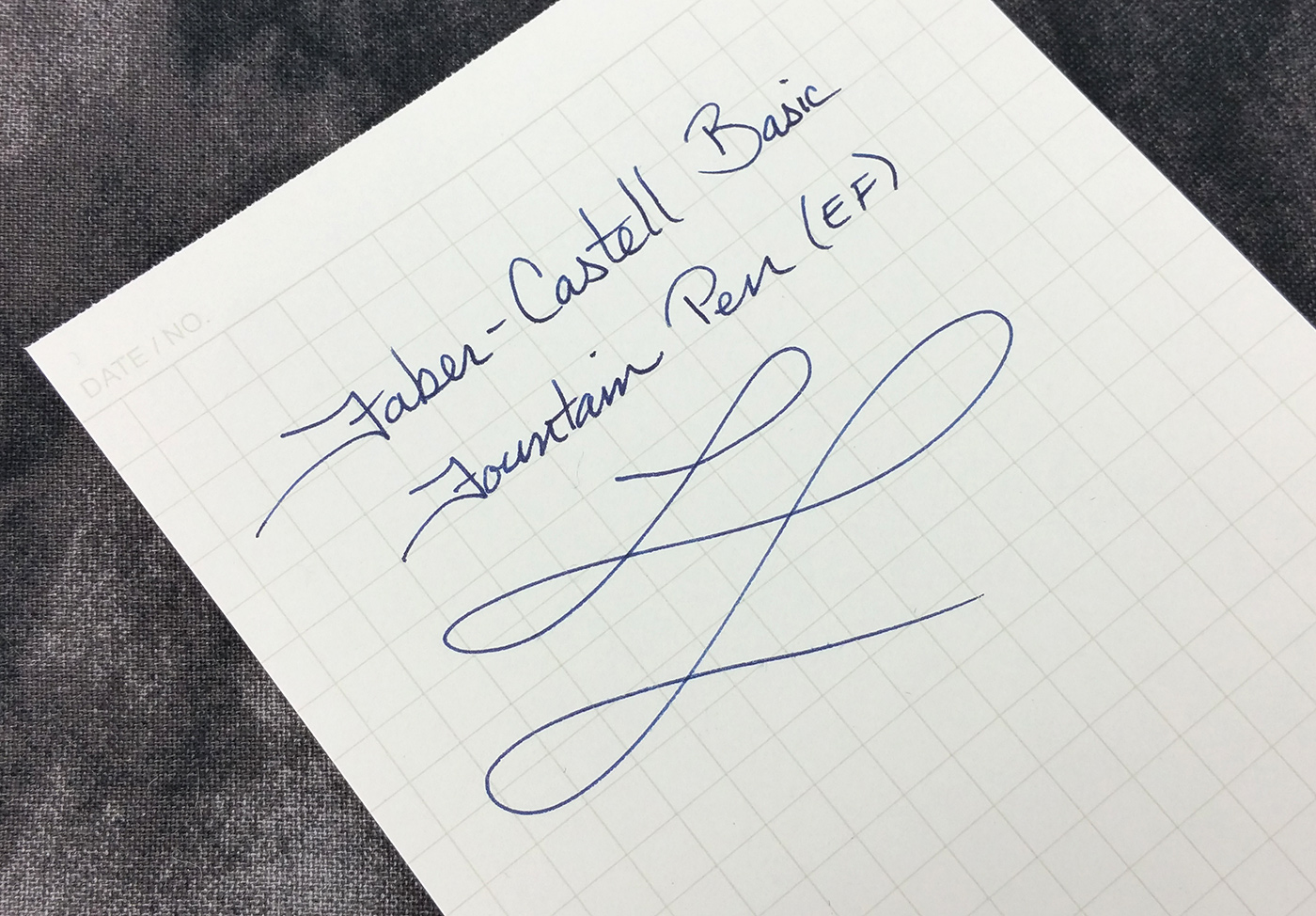
When I first inked up the pen and started writing, I first noticed how fine a line it put down. This is a German pen with a German nib, and I fully expected that it would be closer to a medium grade (as Western nibs tend to run broader than Japanese nibs). I love how fine this EF is. It’s not quite as fine as my TWSBI Diamond 580AL, but it’s definitely fine enough to accommodate my tiny handwriting.
After I finished my happy dance and started writing again, I also noticed how smooth the nib was. It’s not glassy smooth. There’s a small amount of feedback, as I’d expect with an EF. I’ve heard virtually universal praise for Faber-Castell nibs being smooth, and that was also my first impression. However, after a few days, the nib got really scratchy. I pulled out my loupe and made sure the tines were aligned (they were). I pulled out a brass sheet and flossed the nib to make sure there were no paper fibers stuck in there (clean as a whistle). I pulled out the loupe again to make sure the tines didn’t move when I flossed them (they didn’t). It was still scratchy.
Then suddenly after a few days, the scratchiness went away. I didn’t do anything else. It just started writing smoothly again, and it’s been that way ever since. I have no explanation for it. I’m going to assume that there were fibers or something that eventually got knocked out and that the scratchiness was an anomaly. It’s been beautiful since.
There is one potential design flaw with the pen, and that’s with the grooves in the section. Luckily, I’d read about this issue prior to inking the pen, so I didn’t have to find out the hard way. But if you fill your pen from a bottle, you’ll likely get ink inside the first couple section grooves. It’s apparently difficult to get the ink out of there, so you continually get ink on your fingers. That would drive me crazy (I don’t mind having ink on my fingers, but getting ink all over everything I touch afterward would just plain suck). So I filled the converter using a syringe, and it worked beautifully.


Overall, I could happily use this pen as an everyday writer. I could use it to take notes in meetings without it drying out in the middle or causing me hand cramps.
Oh, one thing I just have to mention: Don’t even bother trying to post this pen. Faber-Castell designed the end cap so that the cap can be easily and securely posted onto it, and it works amazingly well. The problem, though, is that when posted, this pen is beyond unwieldy. It’s way too long and way too back-heavy. I mean it is comically, absurdly, bizarrely long.
Value (5/5):
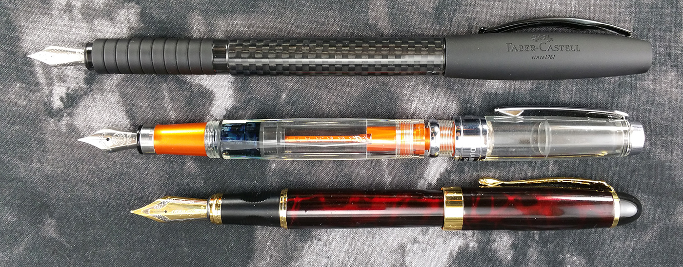
This pen cost me $45 plus another $5 for the converter. At first, I was annoyed that I had to buy the converter separately, but honestly, even at $50, this pen is a terrific value. It’s in the same price range as the Conklin Duragraph ($44), the Sheaffer Prelude 380 ($41), and the TWSBI Diamond 580AL ($60). I’d say the Faber-Castell Basic is ahead of those others in build quality and comfort, and it’s on par with the TWSBI as far as overall writing experience.
With the scratchy nib issue resolved, I’d call this pen absolutely superb.
The Nutshell: Overall Score: 25/25
| Best Qualities | Worst Qualities |
|---|---|
| Top-notch build quality | Slightly difficult to remove the cap |
| Very comfortable | Ink is difficult to remove from the section grooves after filling from a bottle |
| EF is surprisingly fine | Can't be used posted |
| Extremely classy-looking |
Conclusion
The Faber-Castell Basic is typical of German design and engineering: form that follows function, with just enough flair to look beautiful and interesting without crossing into the realm of the gaudy (something a couple of their Italian neighbors should consider exploring). This is the kind of pen that looks equally as wonderful sitting on your desk at home as it would being pulled from the inside pocket of your tuxedo.
It’s hard—if not downright impossible—to not love this pen. When I first inked it up, I expected an adequate but underwhelming experience. But what I found was an exquisitely made writing instrument that blew me away as a writer. The line it puts down is fine and consistent. The nib is smooth and never stops until it runs out of ink. It looks great. It’s put together extremely well. And it just. Always. Writes.
I whole-heartedly recommend this pen. Sure, you can buy three Pilot Metropolitans for the same price, but the materials and overall feel of the Faber-Castell Basic are just fantastic, and I think it provides a much more satisfying writing experience.