

Busy Beaver…Or would that be Busy Platypus in Australia?
Robert Oster might be the hardest working man in the fountain pen ink industry these days. Yeah, yeah, I know…I can hear the chorus of “What about Nathan Tardif?” and I haven’t even pushed the Publish button yet. True Story: Nathan is a machine. But this post isn’t about him, it’s about Rob Oster, who exploded onto the fountain pen scene not even a year ago, but has managed to win the hearts and minds (and money) of fountain pen users across the globe in that very short timespan.
It seems like we can’t go more than a couple weeks without announcements of new ink colors and new stockists (i.e., stores that sell his inks). This guy has been hustling nonstop lately, hand-mixing batches of his luscious serums and fulfilling orders that are pouring in from the four corners of the world. This guy cranks out new inks faster than I can swab and describe them. At this point in time, I’ve got 30 samples to be reviewed…and I just heard about a couple new inks that should be hitting the streets any day.
Here be the next batch I’m looking at:
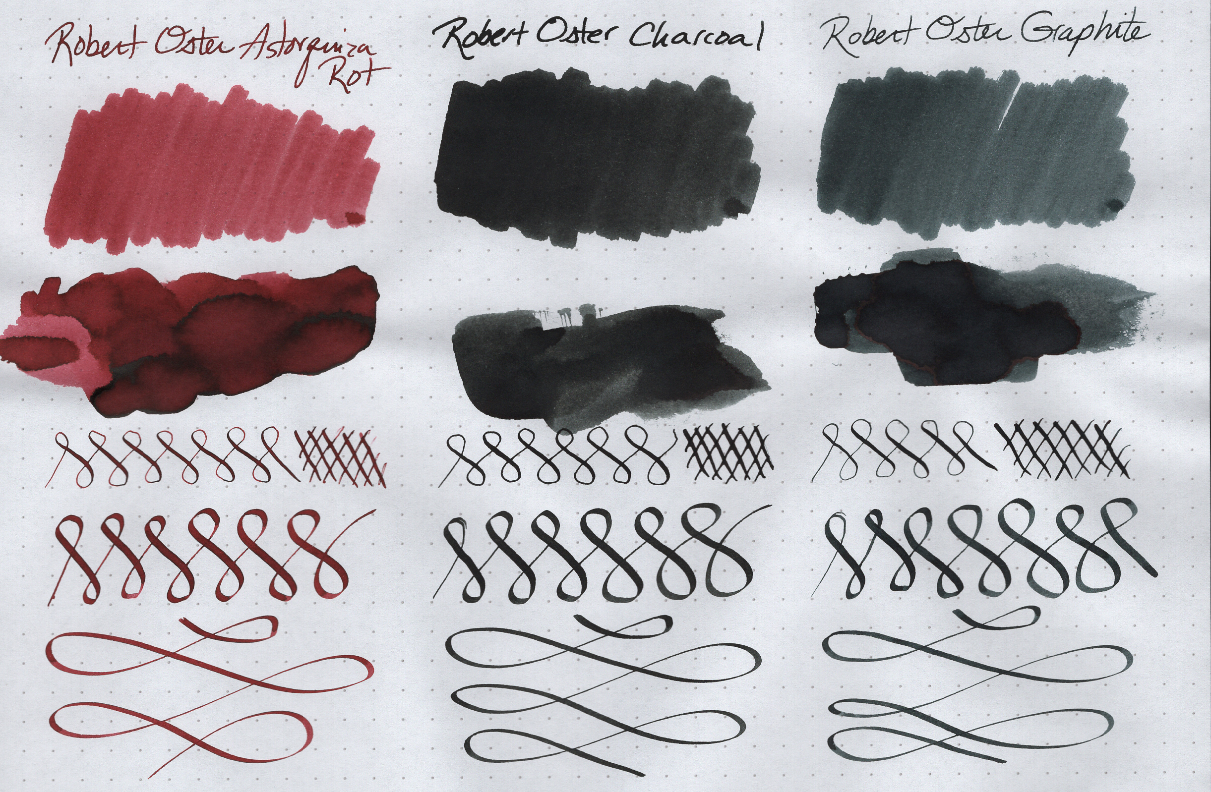
Robert Oster Signature Astorquiza Rot

Astorquiza Rot (rot is the German word for red) is a deep, rosy red. It’s too vibrant to be considered “dusty” rose, but it’s closer to pink/magenta than a true red. It has a very wide range of colors, from a light, dusty pink to a deep purply red.
It has some excellent shading properties, but the amount of shading you’ll see depends on the nib & paper you’re using. For me, the shading was more dramatic in some places than others.
It’s really hard to describe the sheen. A lot of my writing has a dark edging around it. Sometimes it looks black. Other times it looks bluish black. And other times, I swear it has a greenish tint to it, if you catch it at just the right angle.
Overall, Astorquiza Rot is a really pretty color. The shading gives it a bit of an antique feel, but it’s also quite vibrant, so it really pops off the page.
Robert Oster Signature Charcoal

Wrong color or no, this is a beautiful ink. I’d say it’s a very murky, green-black. My biggest fear is that if I decide to get a bottle, I might get a different color!
There is a slight bit of shading, but it’s very subtle, and only shows up with my broad C4 calligraphy nib.
It has no sheen, but has some black edging. The ink is so dark, though, that you can’t really see the edging unless you look really hard.
Robert Oster Signature Graphite
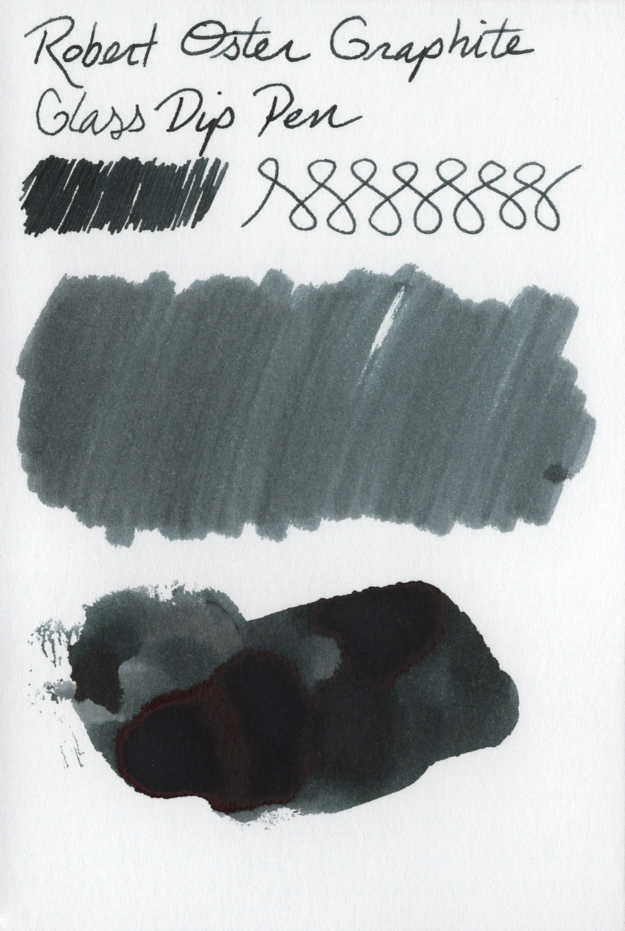
It does have a very light amount of shading that shows up in the broader calligraphy strokes and a couple other areas, but it’s pretty flat with the glass dip pen.
Graphite doesn’t have any sheen, but it does have some black edging around the areas where the ink heavily pools.
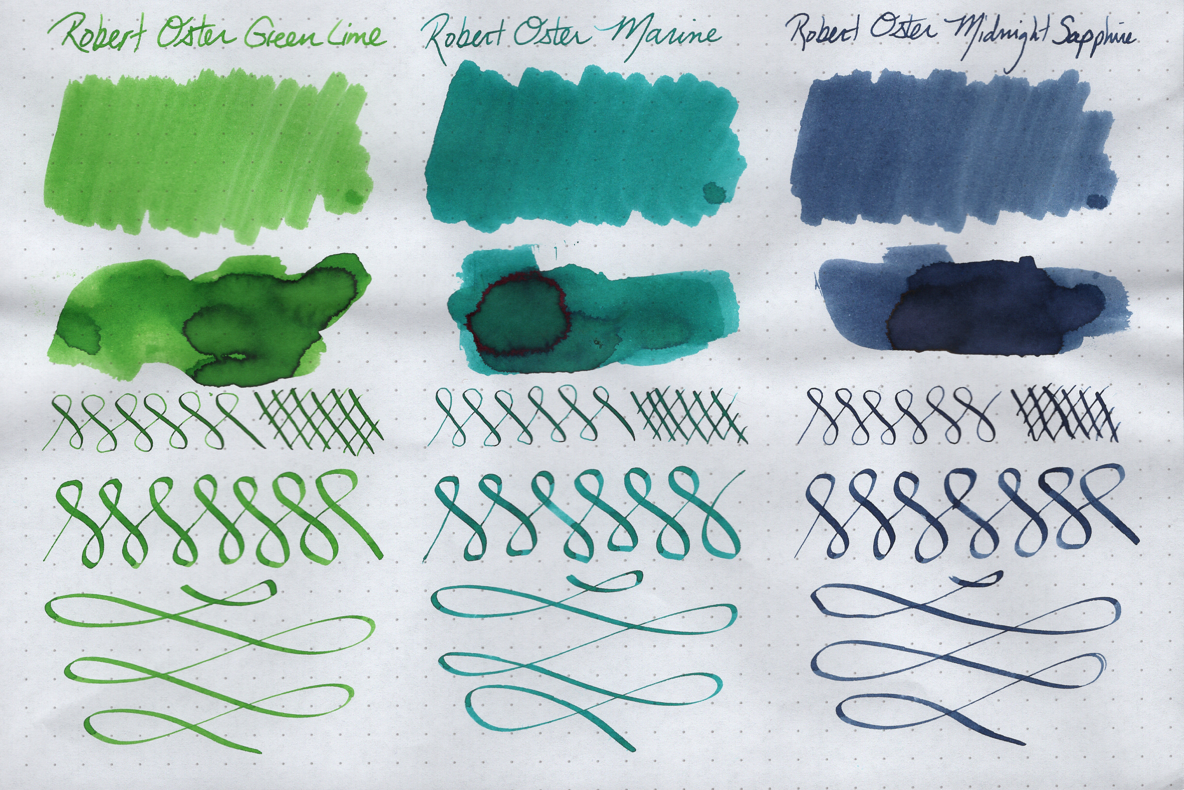
Robert Oster Signature Green Lime

Green Lime is a very light green. I’d say that it has a bit of an “electric” feel to it, where it really pops off the page. It might be a little too light to use in a pen (at least for me); however, my smears show a HUGE range of tones — from super light and pale to a vibrant and beautiful emerald color. I’m going to have to load this into an actual fountain pen to see how dark it looks on paper. If you can find a pen that puts enough ink down to be readable against white paper, this could be a really fun ink to use.
The shading is beautiful and quite prevalent from all the nibs I used. It doesn’t have any sheen, but does have an amazing purply black edging that’s pretty stunning.
Robert Oster Signature Marine

Marine is a bright, vibrant teal color, with a nice range of tones, from mid-range teal to darker, almost Caribbean-Sea-like tones. I really dig teal inks, and this is a strong and happy member of the teal family. It’s pretty sexy.
The shading is outstanding, but seems more prevalent on coated papers (like Rhodia) than it is on non-coated paper (like Bristol Board, Watercolor paper, etc.)
Marine does give you sheen: a bright, sparkly, ruby color. It doesn’t show up a lot in my writing with the various dip nibs, but it produces quite dramatic red edging where it pools.
Midnight Sapphire

Although it’s a darker and relatively more muted tone, it’s still light enough and bright enough to see the actual color. Some of the “midnight” style of inks out there tend to look almost black, but Midnight Sapphire definitely retains its color at all times.
It’s got some decent shading, which is very noticeable with the C4 calligraphy nib…although less so with the glass dip pen.
And there’s no sheen to report with this one.
Bottom Line
Overall, this batch of ROS inks includes a lot of colors that are darker and more serious, but they’re just as vibrant and strong as we’ve come to expect from their inks. Every one of these six inks is beautiful. There’s not a dud in the bunch. I just wish I knew whether or not that Charcoal is actually Charcoal or some other ink that got labeled wrong.
I’ve got another 24 Robert Oster inks lined up to be reviewed, so if you’re a fan of his inks, or just curious about the brand, stay tuned for more!
Other Posts in this Series
Robert Oster Signature Inks (Part 1)
Robert Oster Signature Inks (Part 2)
Robert Oster Signature Inks (Part 3)
Robert Oster Signature Inks (Part 5)