


Robert Oster Signature Inks: That’s a Wrap! (Yeah, Right)
Inspired by the Australian nature surrounding him, Rob Oster engaged in much research and thought, which culminated in his first fountain pen ink: Lime Green (although he originally named it Matcha Green). After coming up with a few more colors, he started selling his inks on eBay. He made a few sales and worked with his customers to understand what makes great inks great.
Sales started to pick up, a few prominent bloggers wrote reviews and spread the word, and at that point, all hell broke loose. In a matter of five months, he went from launch to global distribution “without spending a penny on advertising, without a single call begging for a chance, no appointments to seek approval or shelf space in a store” (Rob’s own words). If it sounds like a cinderella story, it kind of is. I’m sure a little bit of luck played a part in his success. But then again, his inks are really beautiful, so I can see why they took off so fast.
Although I arranged the 18 inks in alphabetical order, each page of six seems to have a theme. The first set was chock full o’ blue. The second set had all the earthy colors I bought. And this set has a pile of autumn colors. I didn’t plan it that way…just a happy coincidence. Oh, and happy Inktober, by the way!

Robert Oster Signature Orange
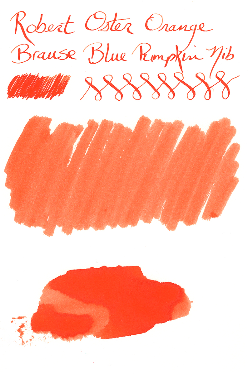
And these samples do not do the shading any justice. It’s not a dramatic shader, but there’s more shading in real life than these images indicate.
Orange doesn’t have any sheen, but it’s got gorgeous, dark carmine red edging around the areas where it pools. Unlike the stark, dark edging in several of these inks, the Orange edging forms as a thicker, more subtle band of darker ink. Orange is a fun and festive autumn ink.
Robert Oster Signature Peach
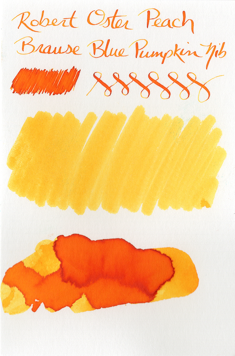
One thing’s for sure, though: Peach has hella shading. It’s crazy. Looking at both my samples, I get everything from a dark, brick-red edging around the pooling areas to a light-to-medium yellow in the swabs. In most instances, the color presents itself in a wide range of yellowy orange tones. It has no sheen, but really kicks the edging into high gear.
It’s a simply gorgeous ink, but I can’t make a recommendation one way or the other regarding its readability in fountain pens. How well it performs is going to really depend on the nib and paper combination you’re using. It’s an ink you’d have to experiment with to find just the right combination to provide readable text. If you use these inks for art, though, this would be a great ink to play with.
Robert Oster Signature Purple Rock

I got some really beautiful shading with the calligraphy nib, but only a tiny bit of shading using the extra fine Blue Pumpkin nib. While I wouldn’t call it an exceptional shader, you can see from the smear samples that it does provide a pretty wide range of tones from a light and dusty grape color to a wicked dark purple-black color.
Purple Rock doesn’t have a sheen, but it does have very dark edging. It happens in the areas where the ink pools, which are the darkest patches. So it’s kind of hard to make out as it’s one very dark area next to another very dark area. You really have to hold it at an angle to see it. At some angles, the edging looks purple; at other angles, it looks black. Very subtle and hard to notice, but nice when you do notice it.

Robert Oster Signature Red Orange
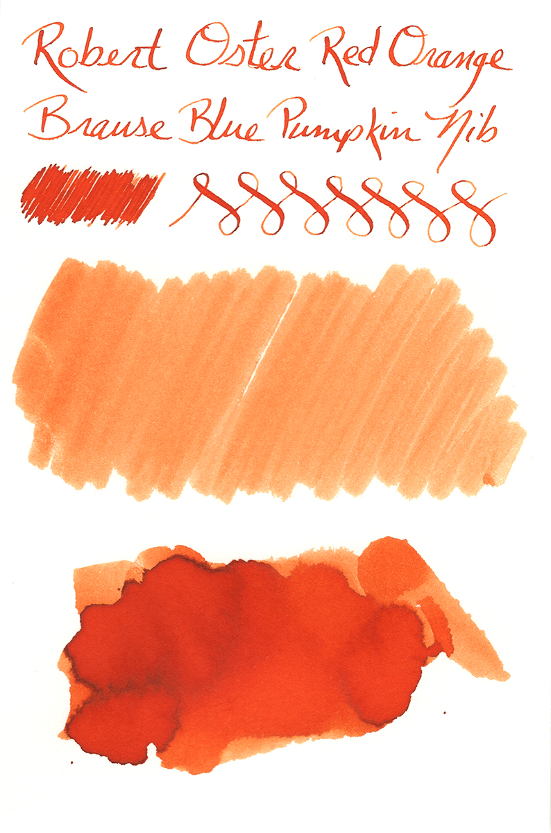
Now ask me what my favorite color is. Go ahead…ask me. Oh, I’m glad you asked! When it comes to hair, the redder the better. Same for cars. For everything else, there’s orange. In my regular world, red and orange are my favorite colors. But that doesn’t seem to translate to inks. For some reason, I hate red inks. I tried Red Dragon. Hated it. I tried Oxblood. Hated it. I just can’t get into them. I don’t like the way they look when they dry. And as for orange, I have very small handwriting and usually opt for fine and extra fine pens…so orange inks are rarely dark enough to use as everyday ink.
But what happens when you mix them together? Bliss, that’s what happens.
Red Orange is definitely in the orange family, so it doesn’t turn me off by being red. The red component darkens it up quite a bit, so it’s plenty dark enough for everyday writing. But the end effect makes the ink lean a little more toward a golden brown hue than it does red. This gorgeous ink just screams autumn. It’s one of the more dramatic shaders of this series, ranging from quite dark to quite light.
And as with the three inks above, Red Orange doesn’t have a sheen, but accumulates a dark, brownish-black edging.
Robert Oster Signature School Blue
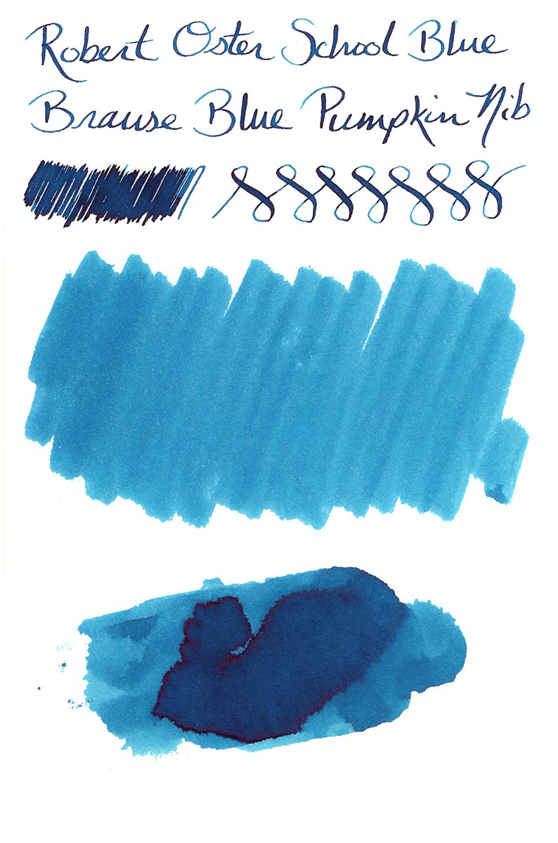
School Blue is a very dark, vibrant turquoise color, way closer to blue, but juuuuuuust enough green to give it a rich ocean color. For as dark as it is, it shades more than I expected it to, especially with the calligraphy dip nib.
School Blue might be my favorite of the range of the teals & turquoises (although Deep Sea is right up there, too). Well, my favorite when it comes to base color, at least. For as gorgeous as this deep turquoise is, it rivals Blue Denim and Blue Sea for brutal ruby-red sheen. I know a lot of people go ga-ga over sheen like this. But as I mentioned before, I don’t dig red ink, so I don’t dig the red sheen obscuring the beautiful, underlying color of the ink. I do see that where I wrote with my calligraphy nib, there’s practically no sheen whatsoever (I see a couple filament-thin traces, but I have to really hunt for them). This makes me hopeful. I’ll have to experiment with this ink in a few pens. If I can find one that doesn’t produce any sheen, this would be a contender for a full-bottle purchase for me.
Robert Oster Signature Spearmint
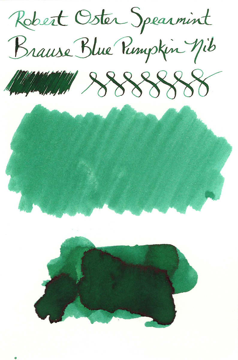
Spearmint is capable of some nice shading, but it’s one of the more subtle shaders in this series. As you can see in the smear samples, it provides a nice range of lights and super-darks that make it interesting while still allowing for consistently dark writing (for all those super-serious documents you’re scribbling at work).
Spearmint is another ink with a red sheen. Although it’s a little darker than the bright ruby color on many of the blues in the series, the sheen is still pretty heavy. Like School Blue, though, the sheen doesn’t come out much from the calligraphy dip nib, so it leaves me with hope.
Bottom Line
I’ve really liked what I’ve seen from the Robert Oster Signature inks so far. This series of 18 inks represents less than half of Oster’s full lineup, but I think it’s safe to say that there’s something for everyone in here. If you like your inks loud and sheeny, they’ve got you covered. If you prefer something more serious that you can bring to the office…something that could almost pass for black but still have an easily discerned color, there are some real beauties here. Or if you’re going for a more muted, antique look for your writing, you’ll find some of those, too.
The Innernets have been blowing up recently over Robert Oster Signature inks. When that happens, it’s hard to tell if the reaction is just the “kid on Christmas morning” effect of having new “toys” to play with, or if there’s a legitimate reason to be all agog over a new product. After playing with these 18 inks, I’m sold. The agog is justified.
Although not all of these inks are destined for my bottled collection (I’m not made of money, after all), there are a number of them that I will certainly buy in their larger volumes. They’re all exceptionally strong colors, and most of them are pretty unique. I’m really impressed with the job Mr. Oster has done, bringing up his new company, producing fantastic inks, and getting them in shops around the world in less than a half-year…and it seems that every week or two he adds a new retailer to the mix. I will undoubtedly be checking out other colors from this brand, and I’ll be sure to add them to this series when I do.
Other Posts in this Series
Robert Oster Signature Inks – Part 1
Robert Oster Signature Inks – Part 2
Robert Oster Signature Inks – Part 4
Robert Oster Signature Inks – Part 5