

Robert Oster Signature: A Tsunami of Color from Down Under
Australia has a lot of the grooviest things on this planet. They have the best spiders. They have the coolest snakes. They have the cutest marsupials. If that wasn’t enough, a mighty wave of new and little-known ink companies are emerging from the wild and wonderful island continent. In the last year, I’ve learned of four such companies from the land Down Under: Toucan, Blackstone, Bookbinders, and the newest kid on the block, Robert Oster Signature. Nestled in the heart of South Australia’s wine country, Robert Oster Signature is a (mostly) one-man outfit run by (you guessed it) Rob Oster. I say “mostly” because he does have a small team that helps him with marketing, science, and finance…but on the production end of things, he’s the man. His web site offers a tiny glimpse into the origins of his obsession with ink, which began in 1989 when he bought his first fountain pen: a Montblanc 146 (he still has his first bottle of MB turquoise ink that went with it).
His inks (including the packaging) are all nature-friendly, and he states that the colors are “a genuine inventory of the Australian palette.” If these inks are any indication, Australia must be a beautiful place.
All over the innernets, people have been going bonkers over the Robert Oster Signature inks…and Robert himself has been going bonkers releasing a crazy number of colors, one after another. I think he’s got over 50 colors as I write this. With all the bonkers going on, I felt left out. So I went a little bonkers myself and put in an order for 18 of his samples.
It would be crazy to try to do write-ups for all 18 inks in one post, so I’m going to do this in three parts…this being Part 1. So without further delay…

Robert Oster Signature Aqua (sample)
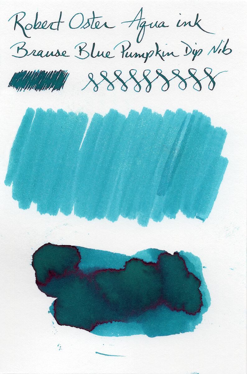
My swatches produced a mighty bright, ruby-red sheen, though. I’m not a big fan of sheen, especially when the sheen is a wildly different color than the base ink color. The way I do my samples usually produces heavy sheen. I can’t load every ink into a fountain pen, so I do my samples with dip nibs, and I do them on Rhodia DotPad paper and Canson Bristol Board…and these combinations really bring out the sheen that a standard fountain pen may not.
I really love this color, and I was disappointed in the sheen, so I decided to load up a fountain pen to see if the sheen would show up as much. It didn’t! Oh, happy day! I did some writing on Rhodia (practically no sheen at all), Tomoe River (some sheen), and the Bristol Board (sheen in a couple small spots). None of these papers produced the crazy sheen that I saw with the dip nibs.
Given this extra testing I did, I would be confident using this ink for everyday use.
Most of the sheen occurs where the ink pools a lot. The shading is fantastic. This is definitely a contender for a full bottle purchase.
Robert Oster Signature Barossa Grape
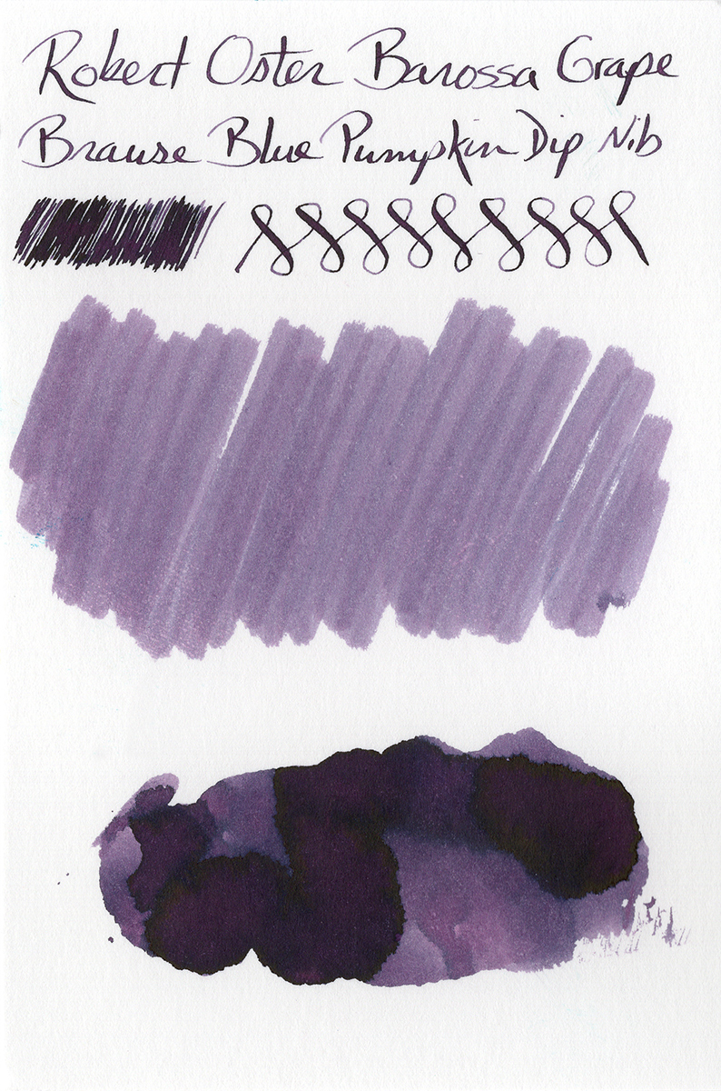
The shading isn’t drastic, but it is there. There’s actually a ton of color variation apparent in the smear samples, although that didn’t translate as strongly when writing with the dip nibs. It’s enough shading to be interesting.
Now let’s talk sheen. I can see it already…you’re going to start thinking I’m a flip-flopper with the sheen thing. I don’t care for red sheen on a blue ink…but if the sheen compliments the color, it can make a world of difference. Case in point: Barossa Grape. It has a sheen…but it’s BLACK, so it doesn’t contradict the base color of the ink. It actually looks amazing.
This is another one I’ll probably get a bottle of. This is going to get expensive.
Robert Oster Signature Blue Denim
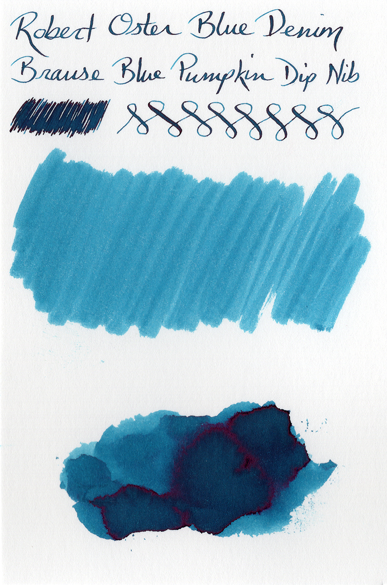
Blue Denim is a lush, deep color with fantastic shading and a ruby-red sheen, but both are slightly less prominent than Aqua.

Robert Oster Signature Blue Lagoon
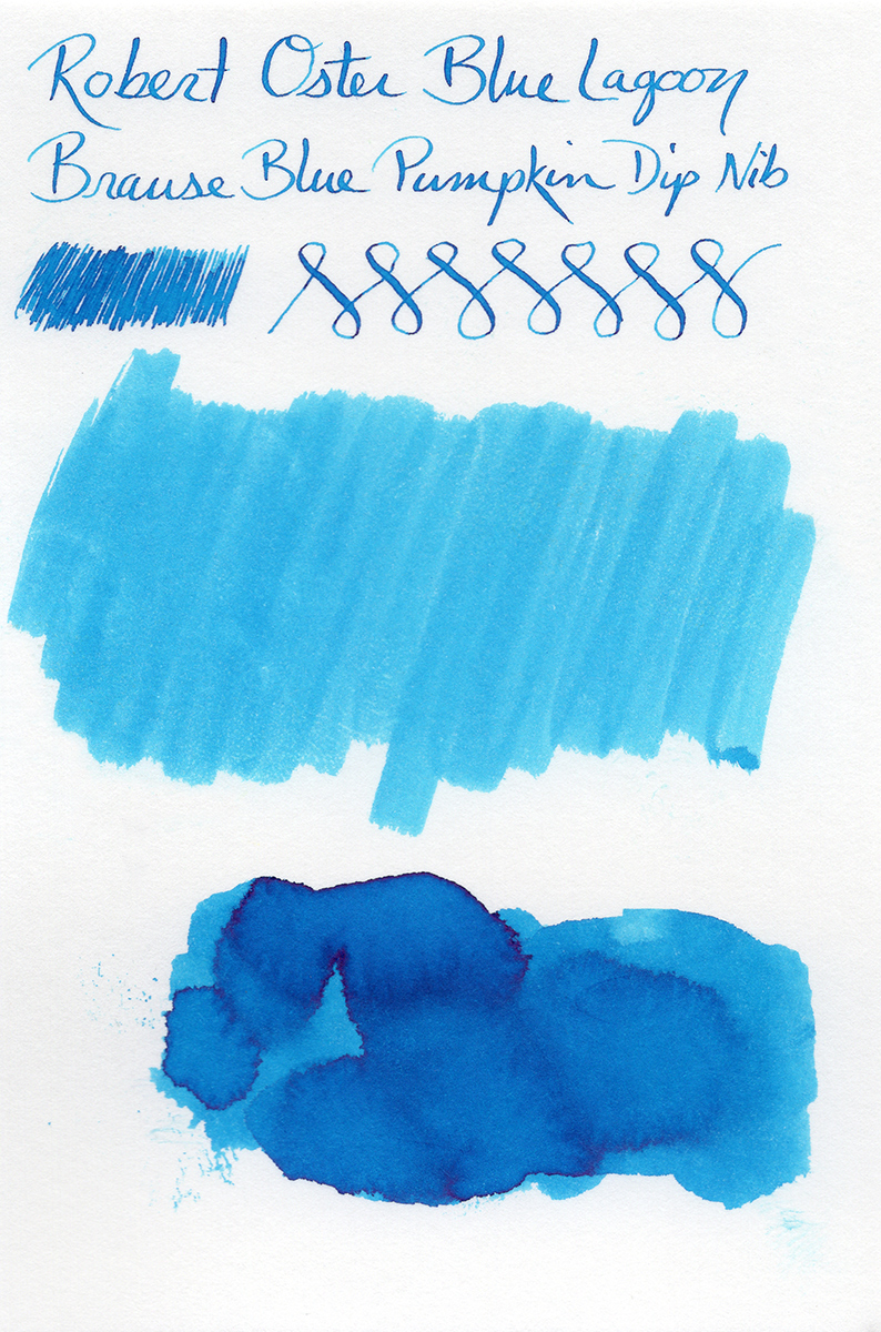
I’m really struck by the number of shades you can get from this ink. The smear samples really show the ranges from a lighter sky blue to a deeper twilight blue (and everything in between). The shading in the writing from the dip nibs is magnificent. The ink is a little lighter than Aqua and Blue Denim, but still dark enough to use as an everyday ink.
Robert Oster Signature Blue Night
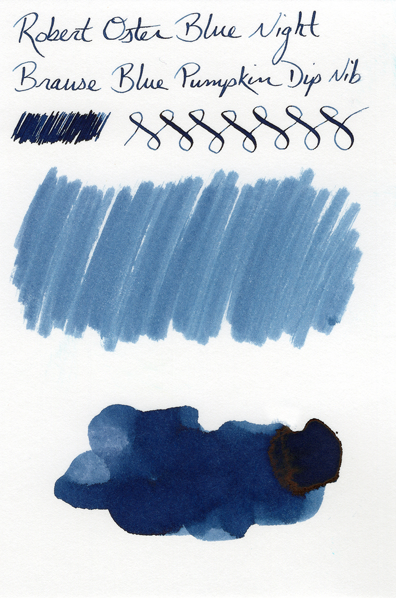
This is another ink that has a wide range of shades, from a more pale, dusty blue to a very rich, deep tone that can almost pass for black. The shading produced by my calligraphy dip nib is really striking.
Regarding sheen, my sample on Rhodia (above) shows some black edging around the pooling areas (that looks awesome). On the sample I did on Canson Bristol Board, there is one area where the ink really pooled, and it has a dark brown-orange sheen around the edges. I think you really have to lay down a lot of ink in an area to bring that out, but it gives a pretty cool but subtle effect.
Robert Oster Signature Blue Sea

Blue Sea is almost identical in tone and intensity to Blue Denim, but it’s less green and more blue (but it’s darker and more green than Blue Lagoon). It’s one of the best shaders of all 18 inks I’m looking at in these three posts…it has a crazy variance in tone. And Blue Sea has one of the most prominent sheens (ruby red, of course).
The base color of this ink is really beautiful, but the sheen (in my opinion) gets in the way.
Bottom Line
These six inks are all stunning colors. I see bottles of at least three of them in my future. Four of the six are capable of producing wild, ruby-red sheen, so if you’re a sheen lover, you’ll go crazy for them. If you don’t care for sheen, Barossa Grape and Blue Night might be just the ticket for you.
All in all, the first six Robert Oster Signature inks in this series are dark, rich, vibrant, and definitely worth using in your fountain pens. For as new as this brand is, I think Mr. Oster has hit the ball out of the park with these colors. Keep an eye out for the next posts in this series, as I branch out into different color palettes that are no less beautiful.
Other Posts in this Series
Robert Oster Signature Inks – Part 2
Robert Oster Signature Inks – Part 3
Robert Oster Signature Inks – Part 4
Robert Oster Signature Inks – Part 5