


This is Part 3 of my Mega Monster Review series on pocket notebooks. You can visit the main Mega Monster Review page for a listing of all the notebooks reviewed in this series. You can also open the massive Master Spreadsheet to see all the aggregated data on these notebooks. Note: This is a work in progress and will take several weeks to complete.
Nock DotDash Pocket Notebooks
Introduction:
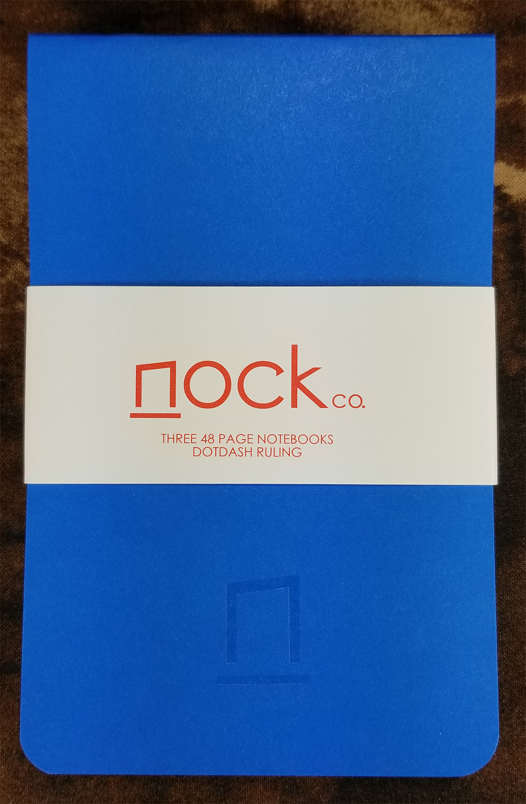
Nock Co. is a small company in Atlanta, Georgia: a collaboration between bag/everyday carry (EDC) designer Jeff Bruckwicki and pen blogger/podcaster Brad Dowdy. Although Nock is mostly known for their (rather awesome) pen cases, they also produce a small range of paper products intended to be both great for EDC and friendly for fountain pen users.
In this review, I’ll be taking a look at their Nikko Blue DotDash pocket notebook. One thing to note: For this series of reviews, I’m trying to avoid covering limited editions that will become unavailable. Although the Nikko Blue notebook had a limited run of 3000 books, the paper they used is exactly the same as in their other notebooks. So all the paper attributes and writing samples I’ve documented are applicable to all their DotDash notebooks.
Description:
There are a ton of pocket-sized (3.5″ x 5.5″ / 9 mm x 14 mm) notebooks out there. Most companies do a decent job of implementing features or designs that set their notebooks apart from the rest, but Nock did a couple of really unique things with their approach: the first is called out in the name “DotDash.” The second the binding.
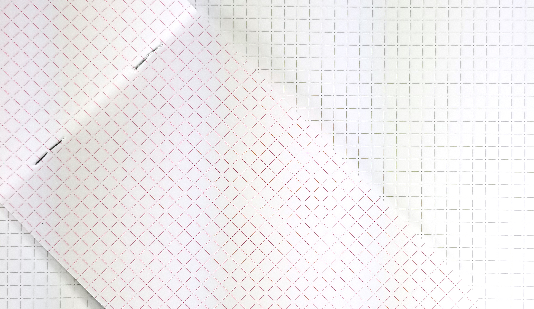
There are a handful of common ruling types in notebooks: lines, dot grid, graph, and blank are the ones you see most often. Nock developed their own ruling design that falls somewhere between dot grid and graph. They call it DotDash, and it consists of small dots spaced 4.25 mm apart in a grid, with thin vertical and horizontal dashes drawn between the dots. The final effect is closer to graph ruling, but the extra white space around the dots makes it look a little more airy than standard graph rules. And I REALLY like the spacing. I have tiny handwriting, so I appreciate the 4.25 mm spacing compared to the 5 mm you find in most graph setups.
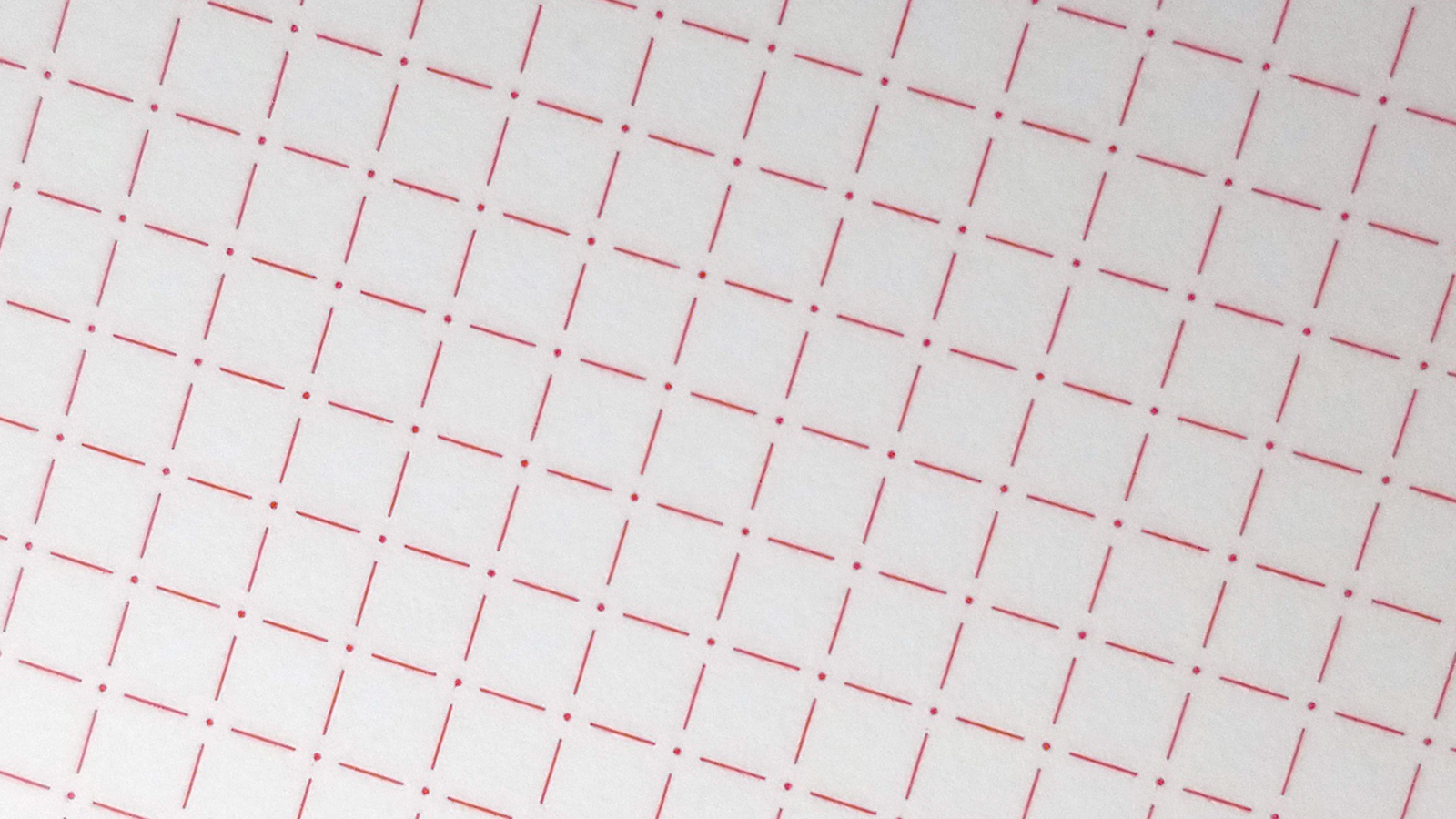
This specific edition uses Pantone Red ink for the ruling. It’s unobtrusive with all the inks I used, but I found the red-on-white effect was a bit loud when writing with the pencils. They write lighter than pen inks, and I think the red competed with the pencil a little. I have a few A6 notebooks from Nock that use a brown ink for the ruling, and that’s beautiful. I’d like to see them use that brown color more often, as it seems to work great with pencil and everything else I’ve used with it.
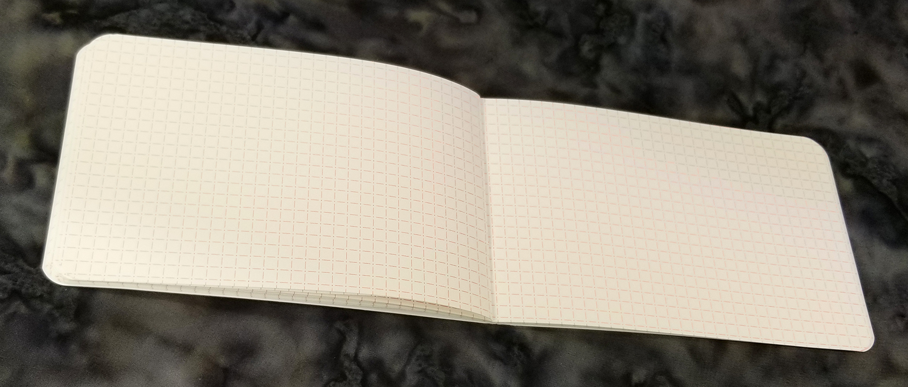
And the other thing that sets the Nock notebooks apart is the binding. They use staples just like many other companies, but the binding is at the top of the notebook, rather than the usual left side, so the pages flip up in a memo-book style. I wasn’t sure if I was going to like this or not, but I’ve found that it actually makes it easier to write when you don’t have a table or other writing surface with you.
Like when you’re shopping or standing around watching your kids at the playground. If you don’t have a table handy and you want to jot something down, a typical side-bound notebook can be hard to write in if you don’t have a pretty stiff cover. But when the notebook is top-bound like this one, you can grip a single page in one hand and use that same hand as your writing surface. While the cover stock on the Nock Nikko Blue is thick, it’s not especially firm. But it doesn’t really matter because your hand serves as reinforcement, making writing really easy.
I don’t know if this was an intentional decision on their part or just a happy accident, but the binding at the top is kind of genius.
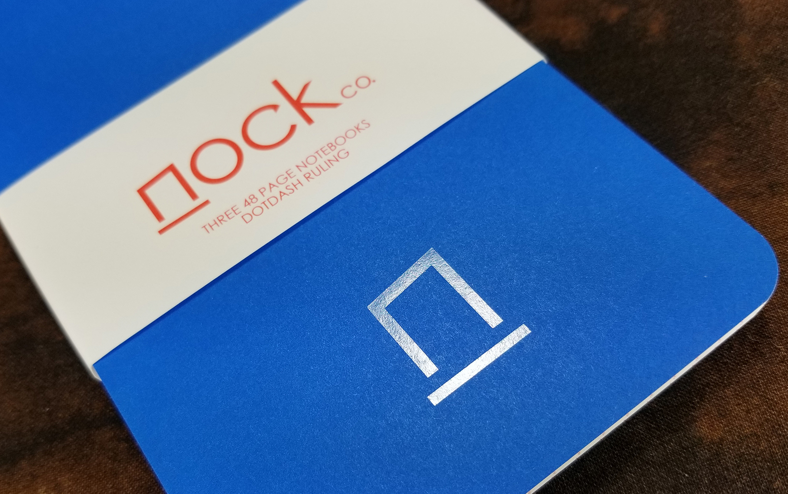
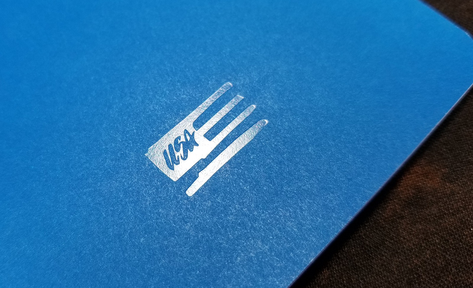
Although not particularly sturdy, the cover is heavy enough to do its job, and it looks good doing it. The cover design is super simple: The Nock logo appears at the bottom center of the front cover, and a USA logo appears in the same place on the back cover. Rather than being printed or embossed, both logos are stamped in varnish, giving them a glossy and slightly recessed look. Classy!
Pencil Results:
Once upon a time, I only used pencils. Specifically, mechanical pencils. I just always liked the way they wrote. Then I got into gel pens, and shortly afterward, fountain pens. I haven’t used pencils much since (only when I’m doing my bills or sketching, really). Something I’m only now noticing while doing these reviews is that pencils make a really cool whooshing sound when you write. It’s pretty zen-like, and isn’t duplicated by any pen that I can tell. I’m digging it. Still not digging the part where I have to sharpen a pencil…but digging the sound, man.
- Palomino Blackwing: Glides beautifully along the paper. Very smooth writing experience (which isn’t surprising given how incredibly smooth the paper is). Pretty dark line, too.
- Uni Kuru Toga Mechanical Pencil (0.5): Smooth and consistent line, with a bit more feedback than the Blackwing. I think the line appears darker on this paper than with other notebooks I’ve tried.

Ballpoint Results:
I’m not sure I’ll ever be able to report bad results from a ballpoint. They’re generally unpleasant as far as writing instruments go, but they always perform well on just about any paper.
- Uniball Jetstream (0.7): I’m pretty shocked at how smooth this pen is. It’s really noticeable when I write fast. Performance is perfect on the Nock paper.
- Fisher Space Pen (0.7): Not awful. Not as nice or as consistent as the Jetstream, though. It’s smooth, but the ink makes writing feel a little pasty.

Gel Results:
These results probably won’t surprise you.
- Uniball Signo 207 Ultra Micro (0.38): The super fine point gives some definite feedback on this paper. The ink goes down fine, but it feels maybe a little scratchy compared to the Jetstream. But the super fine line that comes out of it is worth the added grit.
- Pilot G2 (0.5): Wow. Deep black. Very smooth and consistent. If you’re looking for a black in that really looks black, start here.
- Zebra Sarasa (0.7): And end here. Definitely puts down a thick, heavy black line. The ink does spread just a bit, but you need a loupe to really see it. Then again, this pen does the same thing on every paper I use it on.

Liquid Ink Rollerball Results:
The rollerballs worked fine on this paper, but neither one is perfect.
- Pilot Precise V5 RT (0.5): Not really true black on this paper, and it spreads a little (got a touch of very minor feathering, too). It is smooth, though, and works great for writing fast. Strangely, there’s some weird feedback with this pen. It’s more of a mechanical feel than gritty…like you can feel the ball rolling in the tip. It’s not distracting, and it doesn’t seem to affect the writing.
- Uniball Vision Elite (0.8): It looks darker on this paper than I’ve seen on others, but still not close to being black. Definitely spreads and feathers a little, but very smooth and allows for fast writing.

Fountain Pen Results:
And now for the moment you’ve all been waiting for. Nock paper is billed as being fountain pen friendly. Let’s see how it fared…
- (EF) Platinum Preppy with Noodler’s Midnight Blue ink: Surprisingly, shockingly even, smooth. I love this pen for just about all paper times, and it just sails across the Nock paper. No negative characteristics.
- (F) Lamy Safari with Lamy Petrol ink: Pretty feedbacky, but still smooth. No spread or feathering. Very consistent ink flow.
- (M) Platinum Cool with Pilot Iroshizuku Tsuki-Yo ink: My wettest pen does spread a bit and has a few minor bits of feathering. There are a couple pinpoints of bleedthrough, but the ghosting is so light, you can still easily use the opposite side of the paper.
- (0.6) Nemosine Singularity with KWZ Standard Turquoise ink: Works beautifully. No spread, feathering, or bleed. Perfect.
- (1.1) Conklin Duragraph with Robert Oster Midnight Sapphire ink: This combination has spread on every paper I’ve tried. Although there is a bit with the Nock paper, the results are better than the other notebooks I’ve tried so far. The Platinum cool fared worse.


Vital Stats
[table width=85% colwidth=”35%|65%” colalign=”left|left”] “Attribute“,”Description”
“Brand“,”Nock Co.”
“Model“,”Blue Nikko DotDash”
“Size“,”3.5 inch x 5.5 inch”
“Price“,”$10 for 3 notebooks”
“Binding“,”Top Staples (2)”
“# of Pages“,”48”
“Corners“,”Rounded”
“Cover Material“,”80#”
“Stiff Cover?“,”Not particularly”
“Perforations“,”No”
“Lay Flat?“,”Yes”
“Jeans Pocket“,”Yes”
“Shirt Pocket“,”Yes”
“Paper Weight“,”90 gsm (60#)”
“Paper Color“,”Bright White”
“Acid Free?“,”Yes”
“Ruling Type“,”DotDash”
“Rule Spacing“,”4.25 mm”
“Rule Color“,”Red (Pantone)”
“FP: Feathering“,”Tiny bit with wettest pens”
“FP: Ghosting“,”Very Minimal”
“FP: Bleedthrough“,”Pinpoints with wettest pens”
“FP: Spread“,”Tiny bit with wettest pens”
“FP: 10-Sec Dry?“,”YES, with all 5 fountain pens”
“Pencil“,”Excellent”
“Ballpoint“,”Excellent”
“Gel“,”Excellent”
“Liquid Ink RB“,”Excellent”
[/table]

Conclusion
When it comes to pocket notebooks, any fountain pen friendliness has to be balanced with fast dry times to produce something that can be used for EDC. Nock worked this balance beautifully. The paper works great with most fountain pens (although you probably want to avoid really wet pens), and every pen I tested completely dried within 10 seconds. And an added bonus: it shows off the properties of the ink fairly well.
While the DotDash ruling pattern is unique, the two attributes I appreciate most with these notebooks are (1) the top binding that makes it easy to write and hold the notebook at the same time; and (2) the weight of the paper, which largely eliminates heavy ghosting and allows you to use both sides of the paper. Even with my wettest pens (Cool and Duragraph), the back side of the paper was completely usable.
I’m still early in this massive experiment, but the Nock DotDash notebooks take an early lead on paper quality (which is saying a lot considering how excellent the Story Supply Edition 407 performed). Will Nock stay on top? Only time will tell, but it’s probably going to be pretty tough to beat.
